FRAGMENTS
noun
plural noun: fragments
plural noun: fragments
- 1.
a small part broken off or separated from something.
"small fragments of pottery"
synonyms:piece, bit, particle, speck; - 1.
break or cause to break into fragments.
"Lough Erne fragmented into a series of lakes"
synonyms:break up, break, break into pieces, crack open/apart, shatter, splinter, fracture, burst apart, explode, blow apart, implode
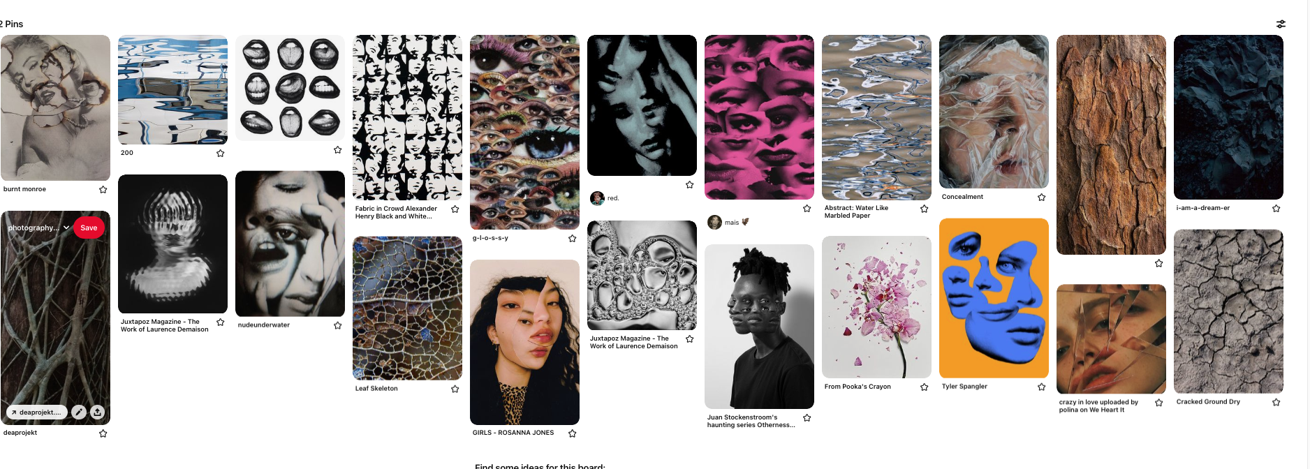
For this project I started to get inspiration from different images of Pinterest and I made a board for a rough idea of what type of photos I would be taking for the theme 'Fragments'.
This is a link to my Pinterest board- https://www.pinterest.co.uk/hopeniamhstacey/photography/
This is a link to my Pinterest board- https://www.pinterest.co.uk/hopeniamhstacey/photography/
|
method
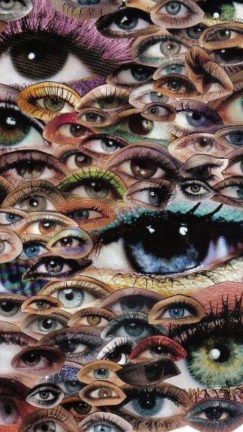
-I took the photos on my photos with my phone and uploaded them to my laptop -then on Photoshop I added a blank digital paper wit dimensions of 75cm by 100cm. - I opened one of my photographs, pasted it onto the digital paper and used the lasso tool to make sure I only selected the eye. - I kept doing the previous step with each image and rearranging each eye to the position I liked, also considering the size, angle, layers and the colour. - Lastly I flattened the image so it was the right size to save and upload as a JPEG |
        |
Inspiration: My image:
|
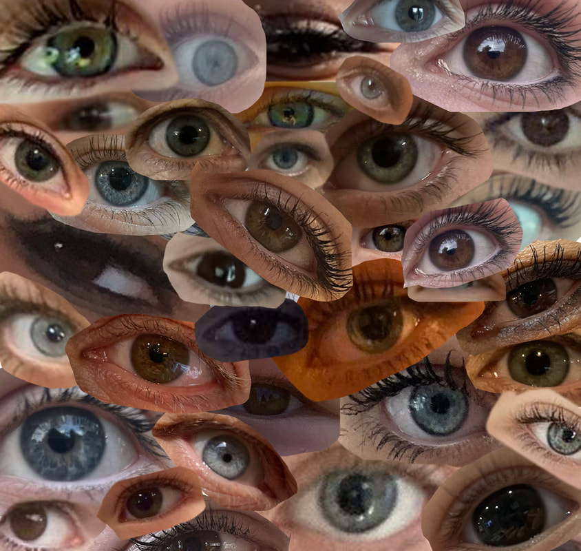
WWW- I like how there is variety of eye colours and lighting because it creates a more compelling image. Also I used photoshop which was good because it developed my ability at digital editing.
EBI- If I were to further develop the image I would put different eyeshadows on the eyes I'm photographing to create a more interesting image. I could have also been more precise when cutting the shape around the eye. |
section 2
Daryna Barykina - 'Bruised Behind the Mask'
As an artist, Daryna Barykina visually tries to capture the essence of contemporary society. Themes explored through images are those that depict the often hidden but devastating effects of modern life. Barykina's goal is to create controversial images that provoke conversation. Through the use of bold colors, photo manipulation and retouching techniques, the artist builds a vernacular between the artist and the viewers. This series from Barykina explores one of the ubiquitous social issues – domestic violence.
When Barykina first moved to the United States three years ago, there was immediate shock at the scale of tragic social impact caused by this social problem. Barykina was also impressed by the level of effort put into raising awareness and helping victims cope and overcome. Unfortunately, these subjects are not spoken about and often suppressed.
In this series, the damage and devastation of domestic violence is revealed behind a facade. The subject is portrayed as a fragile porcelain doll concealing her bruises behind a mask of normalcy. Every morning she "glues" herself together. Every evening there are more shattered pieces. This cycle repeats again and again, becoming more and more degrading with every incident. Barykina was inspired to create the concept of domestic violence following a news story of the 212-pound NFL football star, Ray Rice who battered his 115-pound girlfriend and then dragged her limp body into the lobby. He received only a "slap on the wrist" for this act of violence.

|

|

|
|
method
- Firstly I used my phone to take portraits of people which I uploaded onto my laptop - Then I downloaded a cracked earth photo off the internet, I opened both the portrait and the cracked earth image onto photoshop -I put the crack earth image over the portrait and lowered the opacity of that layer to 20% - I used the eraser tool so the cracks of the image were only on the face and part of the neck. -I used the burn tool to make the area of cracks near her hairline darker and the dodge tool where the cracks and the unedited skin met to lighten it. - The cracked earth image wasn't the exact size for the part of the face I wanted it to be on so I used the clone stamp tool to give me more freedom in where the cracks went . - To blended together the cracked and non cracked I use the smudge tool - Finally I flattened the image so it was a small enough to be a JPEG so I could upload it to weebly |
|


inspiration: my image:

|

|
I accurately mirrored the cracks on the face, however I couldn't reveal the bruise under the mask. Therefore if I were to further develop this, I would created a bruise behind to produce an image that more fitted the message Daryna Barykina told. I also like the subtleness of the cracks as it could signify that people being domestically abused try to hide/ disguise their suffering.
|
method
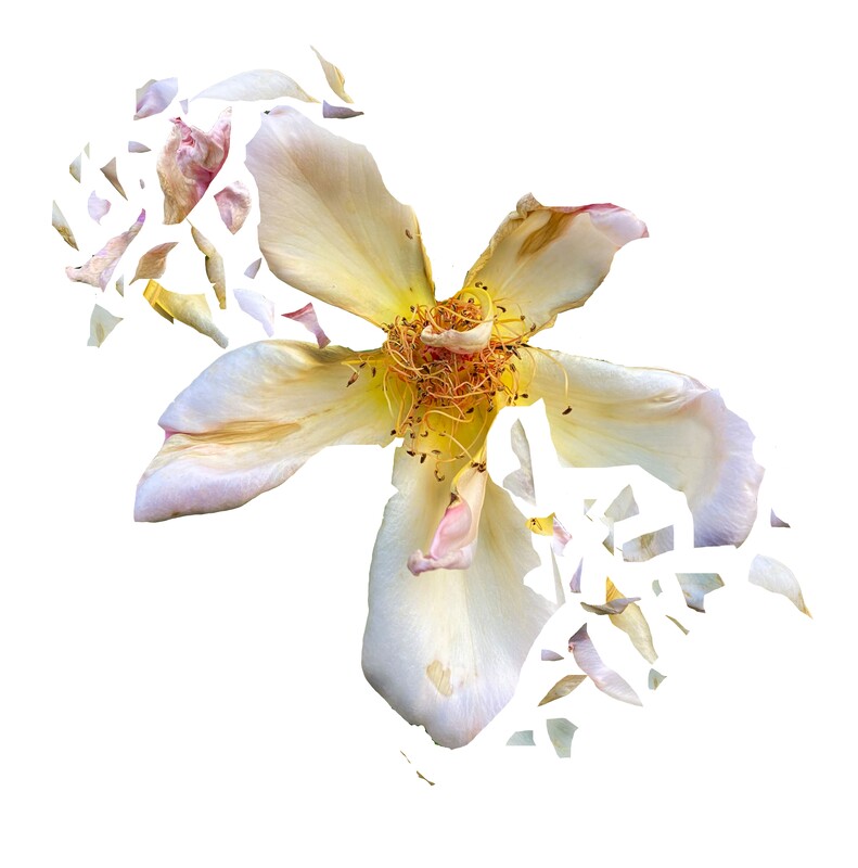
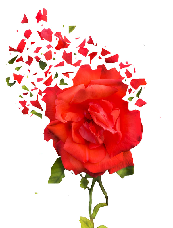
-I took the photos on my photos with my phone and uploaded them to my laptop -then on Photoshop I added a blank digital paper with dimensions of 75cm by 100cm. - I opened one of my photographs, I began to use the magnetic lasso tool to only select the flower and then moved it onto the digital paper - After i started to select certain fragments of the flower with the normal lasso tool that I wanted the separate from the whole flower - Once the fragment was selected I cut it and then pasted it, I rearranged the fragment to where I wanted it and altered the size. -I continued doing the previous step until I was happy with all the positions, shapes and amount of fragments. - I flattened the image so I could save it as a JPEG and then uploaded it to my weebly I really like the more minimalistic flower as the fragments look more delicate which mirrors the beauty of nature. Also in the white flower the shape made it more easy to fragment compared to the red flower, that i found difficult to maintain nice looking fragments and whole flower. However the red flower is more captivating as it contrasts majorly to the white simplistic background the flower is on. Whilst cutting out the flower on photoshop, I feel I could have used more precision to execute a more technical final image. Furthermore I think I accurately replicated my inspiration I found and would like to do related things in the future.
|
|


my inspiration: my images:

|
|
|
david hockney:
David Hockney (born 9 July 1937) is an English painter, draftsman, printmaker, stage designer, and photographer. As an important contributor to the pop art movement of the 1960s, he is considered one of the most influential British artists of the 20th century.
Hockney has owned residences and studios in Bridlington, London and Normandy, as well as two residences in California, where he has lived intermittently since 1964: one in the Hollywood Hills, one in Malibu, and an office and archives on Santa Monica Boulevard in West Hollywood, California.
On 15 November 2018, Hockney's 1972 work Portrait of an Artist (Pool with Two Figures) sold at Christie's auction house in New York City for $90 million (£70 million), becoming the most expensive artwork by a living artist sold at auction. This broke the previous record, set by the 2013 sale of Jeff Koons' Balloon Dog (Orange) for $58.4 million. Hockney held this record until 15 May 2019 when Koons reclaimed the honour selling his Rabbit for more than $91 million at Christie's in New York.
|

|
|
first response:
|
|


secondary responses:


method:


chad pitman:
In his series people in progress Chad Pitman takes images that show different parts of a person. In this work he breaks up a person into different parts and focuses on different sections of a persons face and body. By taking the images individually the parts are given new meaning and encourage the viewer to look more closely at the textures shapes and colours that make up a person.
shoot 1:


shoot 2:


The geometric portrait
Gordon Magnin
Gordon Magnin is an LA based artist who uses fashion images and turns them into a unique collage of "altered found images" with his use of geometric patterns. His background consists of a Masters degree from the Southern California Institute of Architecture, a bachelors of science in structural engineering from the University of Nevada, meaning that his skill is entirely self taught and his experience is fewer than other artist who have manipulated images for a longer length of time to get to this level of skill.
He describes his work as "precise, intricate, geometric and destruction". His alteration of single images using precise geometric cuts and operations completely re structure the form of the original photos, and due to the majority of his photographs being portraits, the repositioning of geometric shapes cause deceptions at first sight as the eye is not used to features of the face being in strange places, which is what makes his work so unique and individual. His use of black and white colouring accentuates the features of the face even further due to the quality and use of shadow in his photographs.
His aim of work is to break down the expectations of perfect looking models and to challenge the industry's perception of beauty (he says "he tends to make the beautiful ugly") who said that his work was too extreme for them. He uses similar digital manipulation of images with exactly the same concept as when models would be altered to look unrealistically fake in campaigns and advertisements etc but I believe exaggerates that to mock the industry.

|

|

|
|
method:
- I added a digital paper onto photoshop and opened my portrait - then I used the polygon tool to cut out the shape of a pentagon - I copied this shape and pasted it onto her face, then I rotated it clockwise. - After I pasted it again and shrunk it then rotated it more - Finally, I did that once more |
|


my response
image 1. image 2.
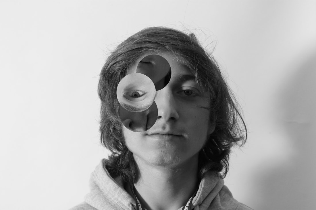
image 3.

|

www: I think the rotation of circles (image 3) mixed with different sizes creates a captivating image as it is more complex than the other two images. I also like the black and white effect on all of the images as this creates a focus on the cutout shapes which overall leads to a set of dynamic photographs. ebi: I also think the image I created using the polygon tool I should have made each individual pentagon equal shape and sizes to create a more technical photograph. Additionally, I think image 3 and 2 could have been taken more in focus and with better lighting to compliment the greyscale effect. |
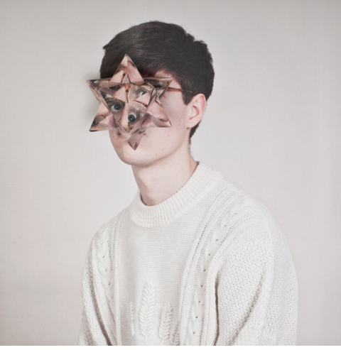
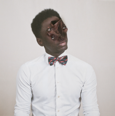
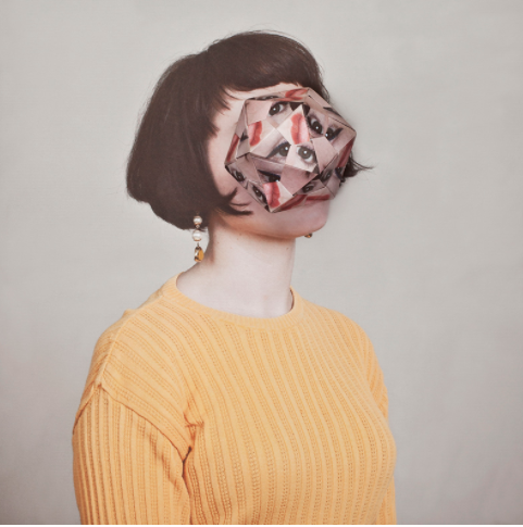
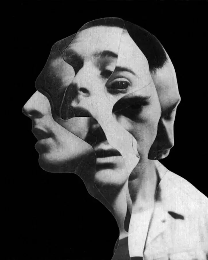
Cosmic Surgery
Alma Hasser
Born in 1989 into an artistic family in the Black Forest, Germany, Alma Haser is now based in London and on the southeast coast. She is known for her complex and meticulously constructed portraiture, which are influenced by her creativity and her background in fine art. Alma creates striking work that catches the eye and captivates the mind.
Expanding the dimensions of traditional portrait photography, Alma takes her photographs further by using inventive paper-folding techniques, collage and mixed media to create layers of intrigue around her subjects; manipulating her portraits into futuristic paper sculptures and blurring the distinctions between two-dimensional and three-dimensional imagery.
Alma has won many awards for her work, including Magenta Foundation's Bright Spark Award in 2013 for her Cosmic Surgery series (also the basis of a successful self-published book project). Her piece The Ventriloquist was shortlisted for the Taylor Wessing Portrait Prize at the National Portrait Gallery in 2012. Alma also won the PDN Photo Annual Award in 2016 for her Eureka Effect series. Her work has been exhibited worldwide and recent venues have included the 2017 Saatchi Gallery show From Selfie to Self-Expression. Examples of her work are currently on show at the Now Gallery in Greenwich, London.
Alma’s current projects include the Twin Puzzle series, delving into her fascination with identical twins, their genetics and how to distinguish them. She’s also been working on her Plant series; an exploration of what is real and what is manufactured, through using her unique paper collage and re-photographing techniques.
|
|
|
my response
|
method:
-I printed out two lots of the portraits in black and white. -Then I used a template for the shape with the tabs and stuck it on top of the portrait. - I then cut out the template and folded it into a 3D pentagon. -Finally, I positioned this onto the other print out of the portrait and took the photo to recreate Alma Hasser's images. |
www: the 3D shape on the original portrait isn't crumpled up, so it looks quite polished which makes the photos look more technical like Alma Hasser's. Additionally, I think to add more variety to the set of photographs I would finish some of them in colour rather than only black and white.
ebi: to further develop my final image, I would use different templates of 3D shapes to create a set of more varied photos. Also, the photographing of the photos could have had better lighting and been more in focus, so they were clearer to analyse and see. |

|

|

|
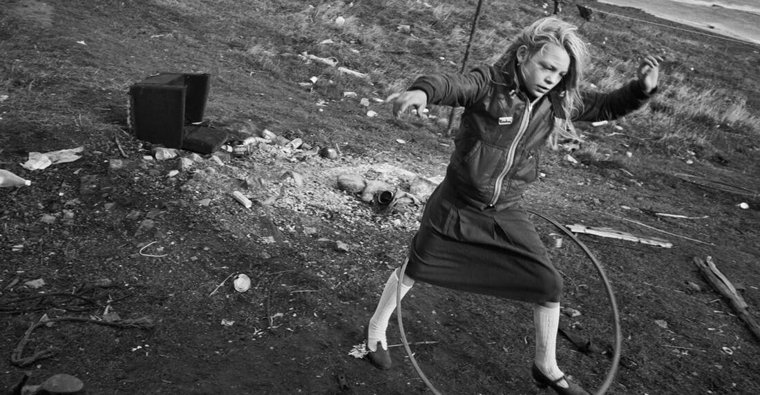
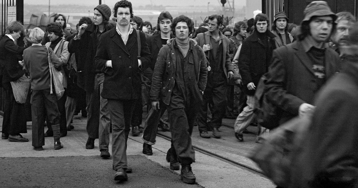
Chris Killip
about him:
Chris Killip (b. 1946, Isle of Man, d. 2020, Cambridge, USA) left school at the age of 16 to pursue a career in photography. In 1964 he was hired as an assistant to photographer Adrian Flowers before working as a freelance assistant in London from 1966-69. In 1969 he ended his commercial practice, returning to the Isle of Man where he created his first major body of work. In the following years, he was founding member, curator and advisor for Side Gallery, Newcastle-upon-Tyne and its Director from 1977-9. Whilst living in North East England, Killip photographed extensively throughout the region. He committed to long term projects there, the most significant being a community of seacoal workers, the 1984 miners’ strike, shipbuilding, and Skinningrove, a coastal village that once thrived on ironstone mining, ironworks, and fishing. His seminal book from this period, In Flagrante, is considered one of the most important post-war photo books published to date. In 1989, he received the Henri Cartier-Bresson Award. In 1991 he took up a teaching position at Harvard University, where soon after he was named a full-time senior professor, chaired the Department of Visual and Environmental Studies for a number of years, and taught until December 2017. In 2020 he was given the Dr. Erich Salomon Award in acknowledgement of the outstanding achievements in photography, gained though his 50-year career. His work has been the subject of numerous international solo exhibitions and is held by significant collections including MoMA, New York; George Eastman House; The J. Paul Getty Museum, Los Angeles; Museum Folkwang, Essen; the Stedelijk Museum, Amsterdam; Tate, London; and the Victoria and Albert Museum, London.
examples of his work:

|
|
|
|
the exhibition:
what was it about? - In his exhibition the images depict an environment that for centuries had evolved from the industrial revolution, and he documented the individuals and communities whose lives depended on heavy industry, people who were facing a politically forced change to the landscape and the ways of life that had been settled for generations. This retrospective exhibition of more than 140 works, serves as the most comprehensive survey of the photographer's work to date and includes previously unseen works. how did he curate his work? - His sustained immersion into the communities he photographed remains without parallel. Whilst marking a moment of deindustrialisation, Killip's stark yet tender observation moves beyond the urgency to record such circumstances, to affirm the value of lives he grew close to - lives that, as he once described 'had history done to them', who felt history's malicious disregard and yet, like the photographer himself, refused to yield or look away. His work was very important in expressing the struggles that others expierience. what was the purpose of his work? -against a background of shipbuilding and coal mining, he witnessed the togetherness of communities and the industries that sustained them and stayed long enough to see their loss. |
three highlights of his work:
|
form over function

first response
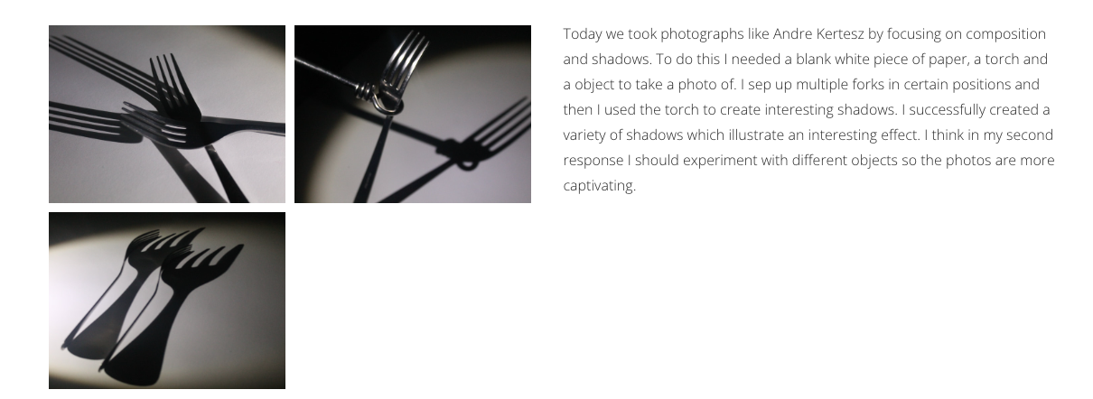
second response
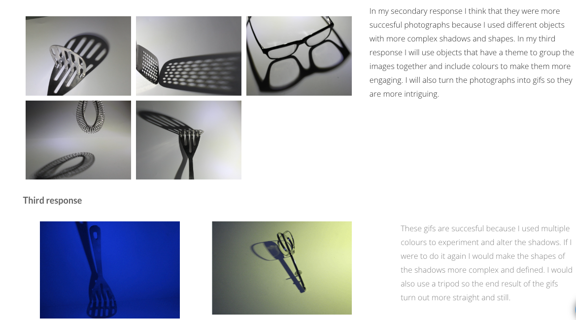

sequence 1

|
|


sequence 2

|
|


sequence 3

|
|


Fragments of buildings
Patrick Cornillet:
Patrick Cornillet is a contemporary artist. Patrick Cornillet is a french male artist born in Nantes in 1968. this series, he has painted architectural elements isolated from their environment and reconstituted in the form of objects on a white background. The concrete makes us aware of the material and of the remains left by the humans and of time passing by. Even if the architectures seem austere, spaces seeming uninhabited, dehumanised, Cornillet creates a particular poetry and a mesmerising mysticism. Cornillet’s more recent work can be viewed as ‘severe’ or ‘naked’. Similar to his previous work a feeling of motion is perceived in these structures. These images evoke the ruins of a fallen society, standing as naked as fragmented.


|

|

|
Mauren Brodbeck
Mauren Brodbeck, a Swiss multisensory artist and singer-songwriter, uses visual and auditory elements to create startling reinterpretations of common objects and experiences. Her multidimensional works invite her audience to step outside their safe and familiar realities and reconsider their relationships with the people and environments around them. Brodbeck's arts education began at the Collège de Saussure in Geneva, where she focused on the visual arts-drawing, painting, photography, sculpture, and videography. After graduation, she moved to the Pacific West Coast for several years, first attending the Vancouver Film School in Canada for a diploma in film production, and then going on to earn a Bachelor of Fine Arts in Photography from the Art Center College of Design in Pasadena, Southern California. As a student at ArtCenter, she gained international attention when her work was selected for inclusion in the inaugural "reGeneration, 50 Photographers of Tomorrow" global travelling exhibition, curated by a committee from the Musée de l'Elysée in Lausanne, Switzerland. The exposure she received led to a solo exhibition with the J.J. Heckenhauer gallery, ongoing representation with the Lumas Editions Gallery, and inclusion in a number of Art Fairs, including Photo Miami, Paris Photo, and the Berliner Liste. Following these successes, she decided to expand into multisensory works and enrolled in the post graduate program at Geneva Haute École d'Arts et de Design "Immédiat" to study interactive arts and new media. Her recent multisensory productions include "Barenaked," a solo show at the Auer Photo Foundation, and "Mood Motel," an interactive, automated installation at the Andata Ritorno Laboratory for Contemporary Art. In 2014, Drago Publishing released a 10 year retrospective of her work, Mauren Brodbeck, Oeuvres Photographiques/Photographic Works: 2004-2014. Brodbeck's pieces can be found in a number of private, public, and museum collections. Brodbeck's current works focus on the concepts of identity, authenticity and territory, exploring the gap between reality and fantasy and reinterpreting common experiences to reshape our stories and emotions. She is also the creator of Raw and Radical, a project focused on inspiring, connecting, and supporting women artists including a series of podcasts. When not immersed in her artistic pursuits, she writes and spends time with her family at their home in Geneva. |


My responses to both Patrick Cornillet and Mauren Brodbeck
Patrick Cornillet: Mauren Brodbeck:

www: I like the variety in the images as one has got a dark and gloomy mood whereas the other has a is bright and lively mood.
ebi: I think both photos could be more in focus and be cut out more precisely with the polygon tool and magnetic polygon tool. method: -I first opened my image and a plain sheet of digital paper, I moved the image onto the paper. -Then using the polygonal tool i cropped only the building, then i selected the inverse and deleted it. -I also zoomed in to get rid of small errors - I downloaded a sky image and moved it to the other image. -The arranged it so it fit on the paper. |

www: I like the contrast with the bold colours as I think it is really clear that my work was inspired by Alma Hasser's work
ebi: I took more time cutting out the building so the final photo looks more precise and technical when it's filled with the foreground colour method:
- first, I select a sheet of digital paper with dimensions 75/100 - then I open one of my images of buildings, which I carry over onto the digital sheet of paper -then I enlarge the image to fit the dimensions of the digitsal paper -after I select the polygon tool and cut out the shape of the building -once only the building is selected, I choose a vibrant foreground colour and fill the building in. |


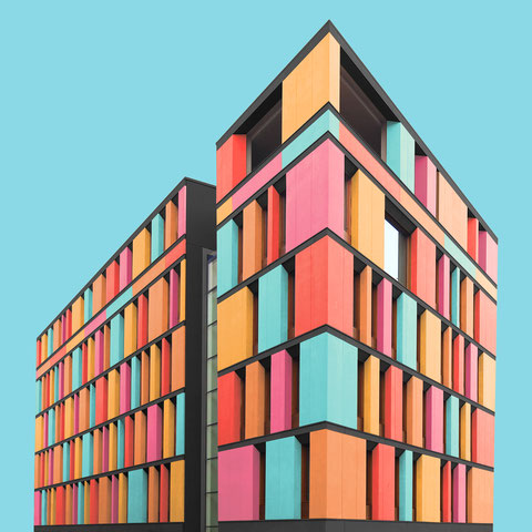
Simplifying Buildings
Simplification denotes reducing the elements in your composition down to a bare minimum—just what is necessary to create the composition. That entails removing unnecessary elements. In a way that is also minimalism.
method:


|
Today we were required to create simplified buildings using photoshop. I took inspiration of Paul Eis to complete this task.
I think what I did successfully was changing the building to simplified through the correct process and method. However if I was more precise when using the polygon tool to outline the shapes changing them into simplified shapes. |

|


Paul Eis
- He was born in Berlin 1998. He finished school in 2016 and then moved to Austria to study architecture at the University of Arts and Industrial Design Linz. Young German student Paul Eis has been documenting the buildings of Berlin and Hamburg but adapting them with bright colours Eis, 18, uses an Instagram account to present his images, which have all been stripped of their context, updated with a new colour palette and superimposed over a vibrant blue backdrop.
He hopes the series will help show there is more to these cities than white and grey facades, and believes the addition of colour can help to highlight the interesting and unique qualities of buildings.
|
|
|


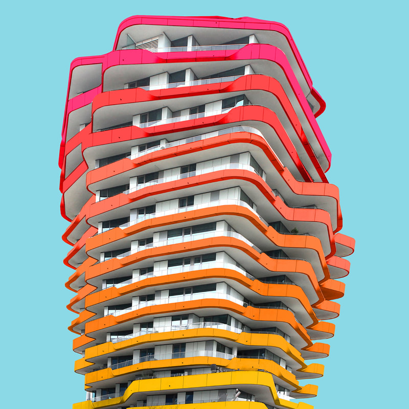
mixed architecture:

|
Today we looked at Paul Eis' work using mixed architecture. We used photoshop to alter the buildings to change the colours of the photograph, this gives the building an interesting effect. Paul Eis said he realised how monotonous the buildings were and he wanted them to look unique and "happy". To match his original idea I added a gradient in colours which look effective when put together.
|


Something that went successfully was that the colours work well together in the photoshopped version of the image and the GIF I made was at the right speed and has a nice contrast from black and white to colour. Although next time I would make more photos with different colour pallets and try to create the images with different types of buildings to add variety.
developmemnts
development 1:
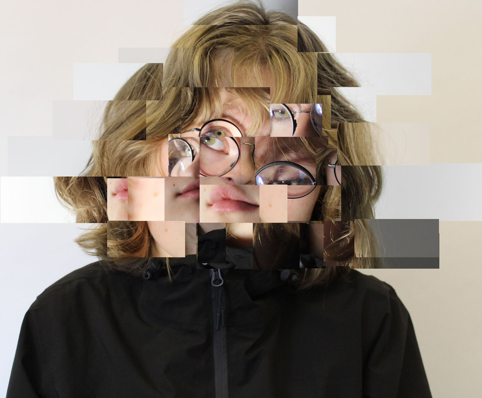
digital fragmented face
|
Daniel Crooks
Daniels Crooks who was born in Hatings, New Zealand and graduated from Auckland institute of Technology. He is a sculptor, photographer and time based artist. His work creates slippages between visual perception and real experience. Combining fragments of movement in his video works and still photographs, Crooks poses a question of the metaphysics of the image and reality. Often this results in memorizing panoramas suspended in time, while his portraits alter the subject by interweaving together multiple narratives. |


|

|
my response
|
method:
-first, I open two of the portraits I photographed with the subject facing in two different angles. - then drag the second image onto the front facing image, with that I use the rectangular marquee tool to select part of the second layers face. - After I select the inverse area and delete that, so that i'm left with a single part of the face, which I then rearrange onto the background where I think it looks interesting - I continue doing this until I'm happy with the amount and organization of pieces of the face. |
|


the photoshoot:
portrait:
1: 2:

3:
|

www: I think I successfully executed the edited photos to imitate Daniel Crook's work. I like the variety of different angles which creates a in depth structure to the images.
ebi: If I had a more organised layout of the fragments of the face, I think the image would look more technical. I also want to create my own development on it so I can have my own ideas and input on influencing the image. |
development 2:
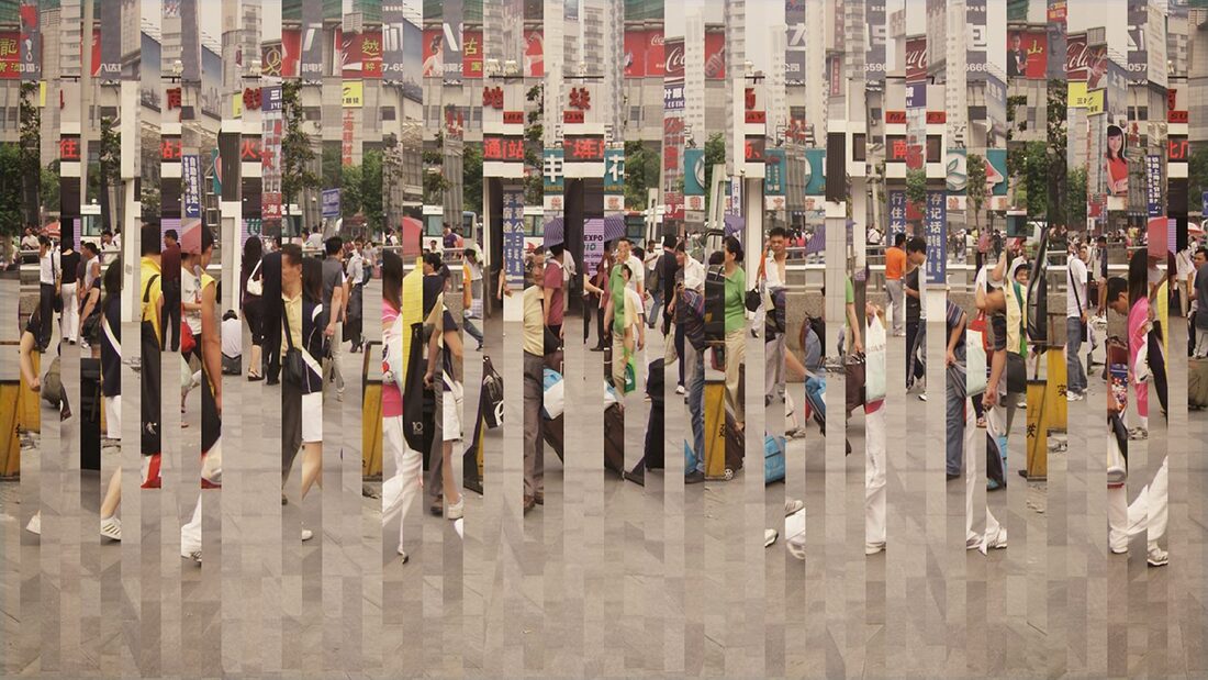
digital fragmented landscape
my response
|
method:
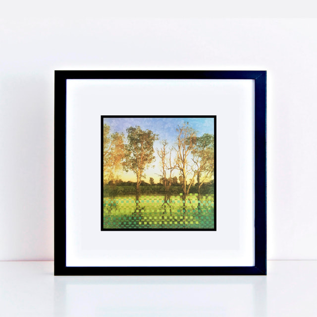
-first, I open the photo on photoshop -then I choose the rectangular marquee tool and select a section/column which has either a small or large width depending on each image. -once the piece section/column is selected I copy and paste it back onto the photograph -after I rearrange the section/column to another area on the photograph - I continue doing this until I'm happy with the number of fragments on the image. |
|


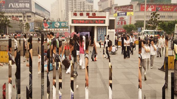
the photoshoot:
landscape:


|
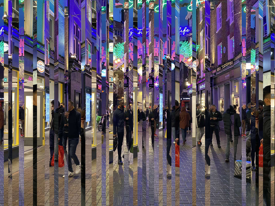
www:I like how each of the three images are very different with what's in the landscape and the lighting in each photograph. Additionally, I like the number of fragments that are in the photo and the orderly effect the image creates.
ebi: If each fragment has a smaller width, it may have created a more complex photo. If I were to reshoot, I would not only use a city but possibly a rural area to show contrast with the images. |
development 3:
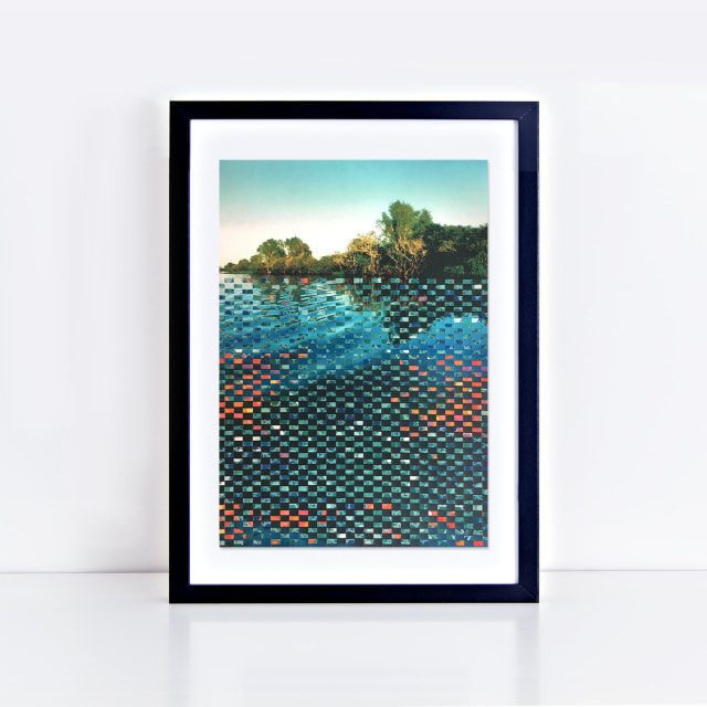
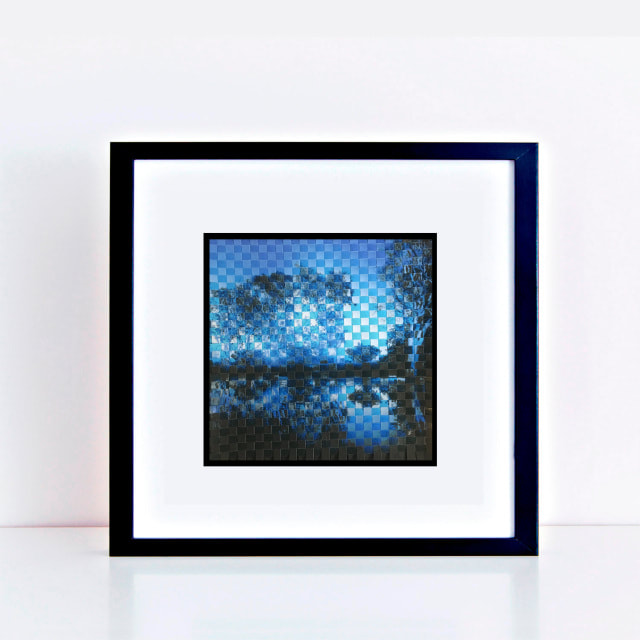
landscape physical weaving
Jeniffer Bell:
about her-Jennifer Bell is an Australian contemporary artist working primarily with intricate painting and paper weaving. Her highly decorative work focuses on the experience of her visual perception, drawing attention to the pattern and detail in often overlooked objects around us. work explores pattern and visual perception influenced largely by her experience of a little known neuro-ophthalmologcal condition which means she sees patterned dots in her visual field, continuously.
These dots appear as a fine veil of dancing, kaleidoscopic colour that can never be turned off. Even on the calmest day and in the simplest of environments, surroundings that may seem static and plain to others are full of movement and decoration. Jennifer shares this unique experience of the world through her art. It has been suggested in recent years as more becomes known of the condition that artists such as Georges Seurat, the pioneer of pointillism, Van Gogh and Yayoi Kusama famous for her dots, may also have experienced the symptoms of visual snow disorder.
It may be a view not perceived by everyone, but no matter how we see the world, pattern still exists all around us both man-made and naturally occurring; from the beauty and complexity of fractals in nature to the printed fabric of your clothing.
Jennifer’s artwork often incorporates recycled materials and images of discarded and decayed objects emphasising that pattern and beauty can be found in everyday things. Understanding that beauty exists in the imperfect.
|
|
|
my response:
1: 2: 3:

|

|

|
|
www: I like that the smaller fragmented photo because it looks more technical and more like Jeniffer Bells work. But I think the photo with larger fragments has a nice effective as the two original photos are quite similar.
|
ebi: I think if all the fragments were equal sections- width and lengths it would have looked more professional. If on the second photo it had two similar photos weaved it would have looked better because it would have looked more like one photo with a similar colour scheme.
|
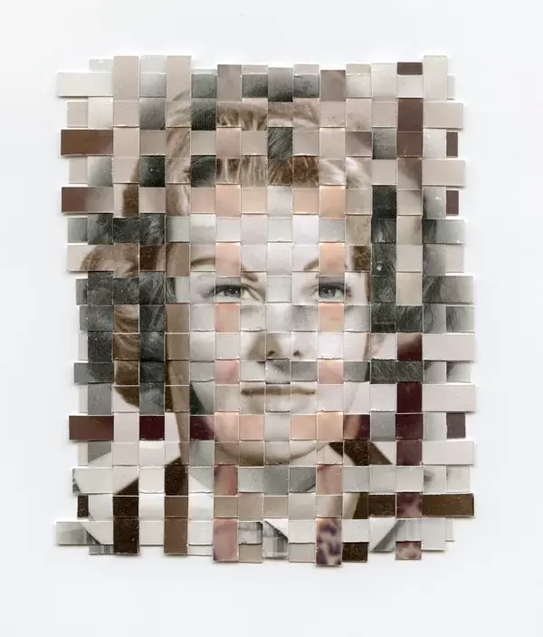
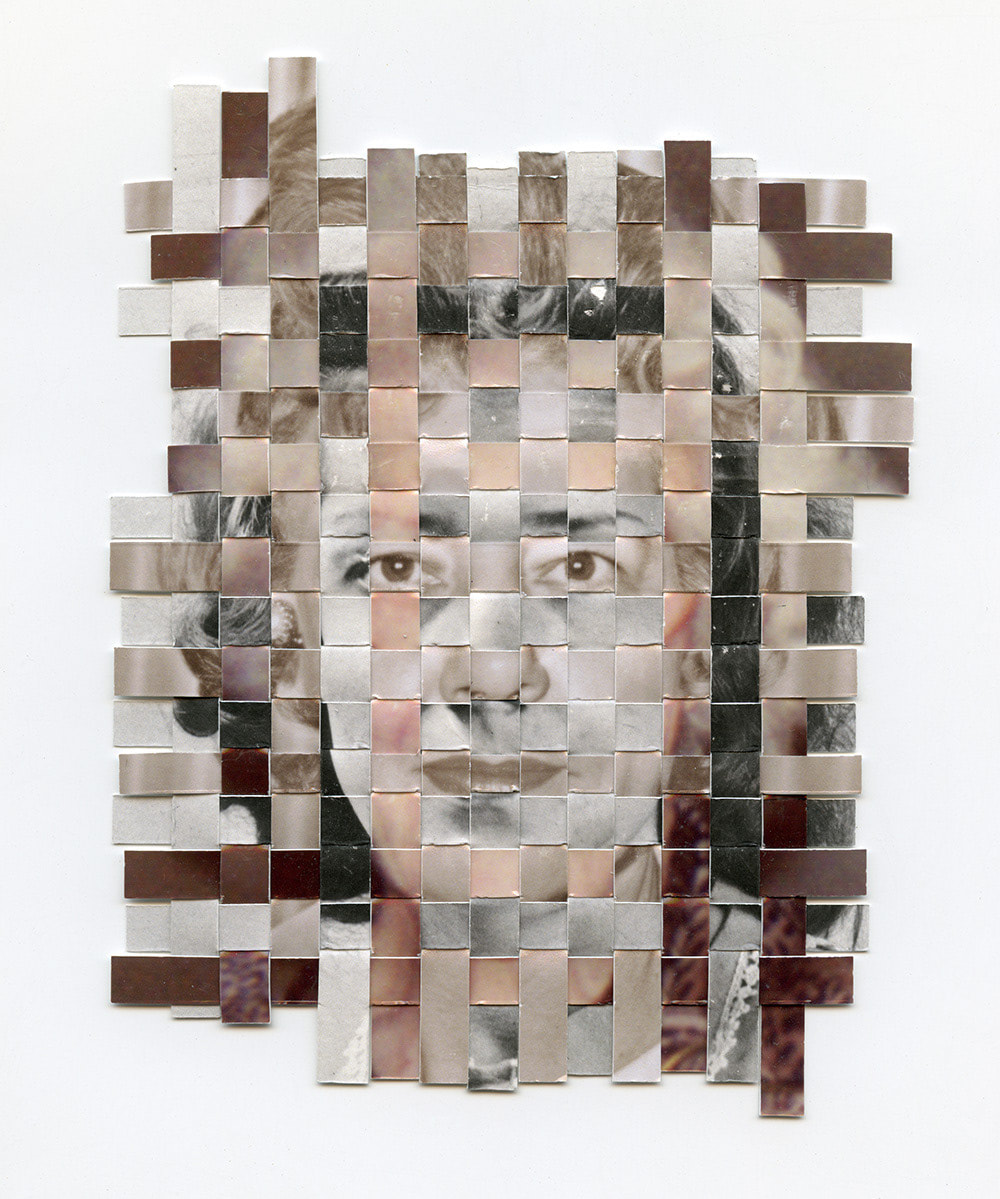
method:
- two different destinations that i paired together, one set at night and one in the day of central London
- then i printed both these photos out and used the gilletine board to cut out the strips
- the photo I picked as the base photo was the front on portrait which i sliced in vertical strips leaving a cm at the bottom.
- then with my other picture i completely cut the strips horizontally
- then i weaved them through each other.
development 4:
physical landscape weaving
Greg Sand:
about him - Greg Sand is a Tennessee based artist with a BFA in Photography from Austin Peay State University. He works almost exclusively with found photography and vernacular images to explore memory, the passage of time, mortality, and the photograph’s role in shaping our experience of loss. Colossal describes his current approach to art as “analog super-edits of the repeated patterns found in old photographs. Drapery, flowers, shoes, shadows, hands, and faces are homed in on and grouped into enormous grids, representing the simultaneous enormity and specificity of human death.”
Sand has been featured in numerous solo and group exhibitions across the country and has received recognition from many jurors, including Guggenheim Assistant Curator Ylinka Barotto and acclaimed artists Shana and Robert ParkeHarrison. His work has been featured in many publications including Colossal, Liberation, Lenscratch, Don’t Take Pictures, and Flow Magazine and has been included in books such as Manifest Press’s International Photography Annual and Gestalten’s Cutting Edges: Contemporary Collage. Sand has received an Individual Artist Fellowship from the Tennessee Arts Commission and was selected by renowned Chicago art dealer Catherine Edelman as her Critic’s Pick at the Griffin Museum of Photography. He has worked with Young & Rubicam to produce a blood donation advertising campaign in Brazil and was commissioned by the Sundance Film Festival to create an original piece. He is represented by Momentum Gallery in North Carolina and Pulp in Massachusetts.
|
|
|
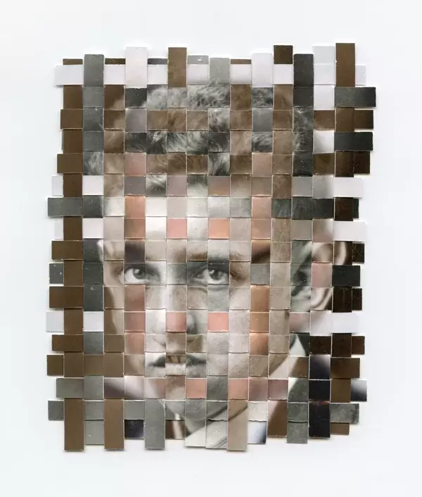
method:
- I took two photos of the same person looking in different angles
- then i printed both these photos out and used the gilletine board to cut out the strips
- the photo I picked as the base photo was the front on portrait which i sliced in vertical strips leaving a cm at the bottom.
- then with my other angle i completely cut the strips horizontally
- then i weaved them through each other.
my response:
response 1: response 2:

|

|
I really like image 1 and 2 because they very polished, as they have equal fragmented strips and are weaved from 2 similar photos which creates a captivating photo. In image 3, despite 2 similar weaved photos the size of the fragments are quite different so it looks quite messy - if I further develop this idea, I will make sure each photo is printed in card so it's less likely to crumple up. I will also measure each of the fragment strips width and length to create a technical final image.
development 5:
physical portrait 'fragmented face'
Kensuke Koike is a japanese visual artist, born in 1980, who’s gaining momentum in the italian and international art scene. It’s difficult to place his art in a specific category, its extensive work touches many ways of expression: painting, sculpture, installations and video art. In fact, he says, “Is up to ideas to choose the way they’ll show themselves”; thus avoiding any limits of creativity, letting it flow, free to materialize in different forms each time. Consciously or unconsciously in Koike’s art there are multiple references to various Japanese art techniques. The concept of assigning a new use and a new life to an object that is now faded into obscurity seems to refer to the Japanese practice of kintsugi, a technique in which gold was used to melt pieces of a broken or damaged item together and increasing its value giving it a new use. Koike also seems to resume Japanese prints Ukiyo-e Sumi-e which are the first to represent domestic scenes and daily life togheter with the two-dimensionality of the images, which, in this case, is given by photography. They also use simple lines to suggest an idea of movement. On the other hand the Sumi-e, prints present a pictorial monochrome style that uses only black ink: the lines drawn with this ink can not be removed or changed. Koike works in the same way in his black and white images as there is no possibility of correction or mistakes of even a single millimeter of the work, as it would involve its loss. His technique requires practice and concentration, a steady hand and a great talent.

|

|

|
the photoshoot:
method:
- first, I took my photos and did a mixture of printing them out black and white and coloured. I also took a mixture of portraits and full body photographs to add variety into my set of work.
- the once printed out the photographs I stuck another piece of paper behind it to add a thicker texture in order for parts of the photo to stand up
- then I cut out the parts of the photograph I wanted to stand up
-finally, I photographed the finished images.
my response 1 : my response 2:

|

|
In my final image, I think I accurately replicated Kensuke Koike's work; I like the selection of features I used, and I layered it over card, so the scalpel cutting was easier and less messy. If I were to further develop the images, I would be more precise when cutting the strips of features, so it looked more uniform and technical. In addition, I would cut smaller fragments, so they easily stood up rather than falling over easily.
development 6:
jesse draxler
Jesse Draxler is an LA-based artist working in mixed media and digital formats to create deconstructed, distorted images that explore ideas around beauty, sexuality and sub-culture. Working exclusively in monochrome, his works are often dark and challenging for the viewer. Draxler discovered that he was colour blind being red-green colour deficient. He studied at the College of Visual arts in St. Paul, Minnesota. Draxler began making exhibitions in 2012. Jesse Draxler's varied influences include heavy metal and zen literature, automotive machinery, background noise, and films. I like his work because it is minimalistic but effective due to the simplistic colours of black and white.

|
|

|
first response: second response:

|

|
final development:
physical editing 'altered faces'
Carlos Cruz- Born in Brazil, became a photographer in 2008 but had an interest in his childhood. Despite little knowledge about him, I find his work very interesting as it includes two of different aspects, collage, digital editing and a scanner effect. Furthermore, I like how his photos are in black and white since it creates a dynamic image with lots of contrast. This greyscale effect also creates a sense of history behind the photos which gives meaning behind each photo leading to a more interesting picture. This links to the idea of fragments and to my last development as they are all fragments of people's faces, in this 6th development I think it has a deeper meaning of fragments in peoples mind - almost the cracking and breakdown people constantly feel.

|

|

|
the photos:
method:
- First I took my portraits
- Then I printed 2 copies of each of them out in black and white
- I cut up one of the copies and made a collage with the features
- Then I used a scanner to create the wavy effect
- I opened photoshop, to edit and rotate the image
- Finally I saved it as a JPEG and uploaded it onto weebly.
my repsonse: 3 favourites

|

|

|
Overall this development is my favourite, I like how I used different types of physical processes and also included digital editing- as I explored new processes, like scanning the image but also developed my collage and photoshop skills. In addition, the greyscale effect creates an almost historic/antique atmosphere and draws attention to the waves on the image. There is lots of contrast in all the images leading to a more eye catching final picture. Specifically in image one, I love the tearing/ripping effect on the paper as you can clearly see the collaging I've done pre scanning. As there is three different models it adds lots of variety in the images, furthermore the collages on each person is different and so it's the type of scanning. If I were to further develop this I would collage more on the original image before its scanned and rather than only using front on photos I would get the subjects to look in different angles. Finally I would compare the final edited photos to the original images.
conclusion:
'Fragments' as a title really enabled me to develop my skills in photography - photoshopping images and learning about physically mutating images, weaving, cutting out, scanning etc. On photoshop I experimented with lots of different tools and settings: lasso tool, polygonal tool, greyscale and so much more. It also allowed me to photograph a widespread set of things, both portraits and landscapes and different objects, which led to lots of variety throughout this topic. I enjoyed the freedom with doing my own developments and researching my own artists, 'Fragments' led me to see lots of different galleries, one of my favorites I saw in my own time was The National Portrait Gallery. Not only did I enjoy the freedom of working independently but the set tasks were interesting and allowed me to work on things that I previously found difficult in the 'Enviroment' topic. One thing I would have liked to do is experiment with the fragments of water, photographing ripples, as the natural effect of fragments is very compelling. Overall I thoroughly enjoyed working on the topic 'Fragments' and look forward to progressing overall with my photography ability.
order of my developments:

